KOT13 barber studio rebranding and web development
Task
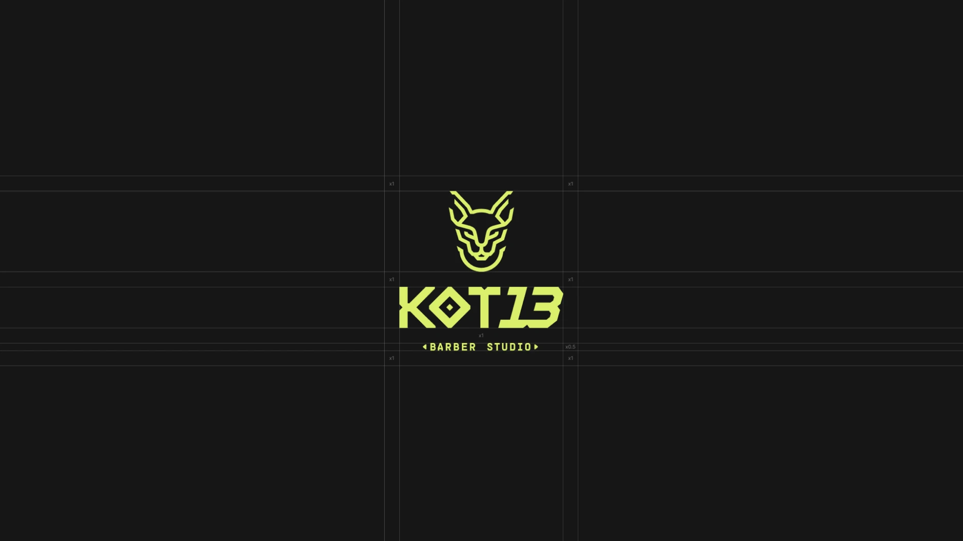
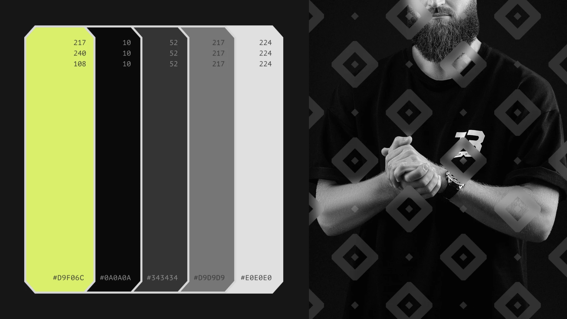
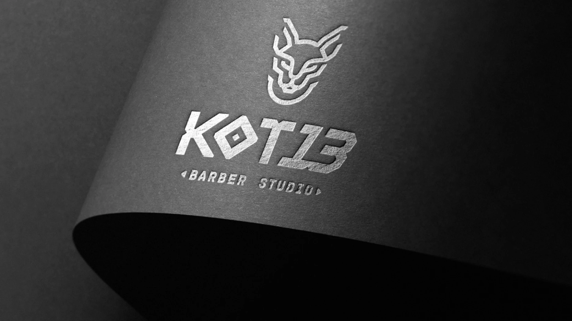
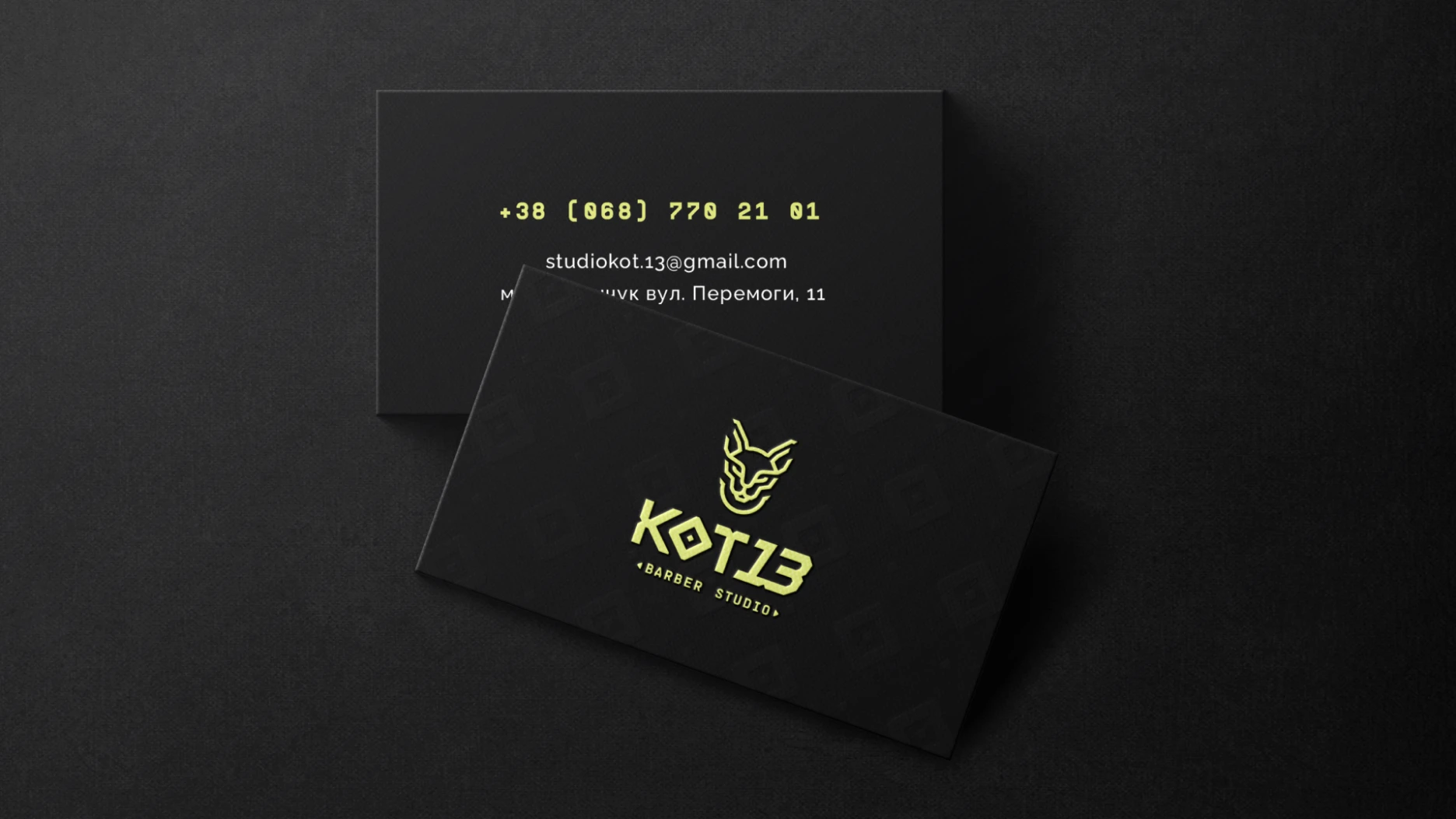
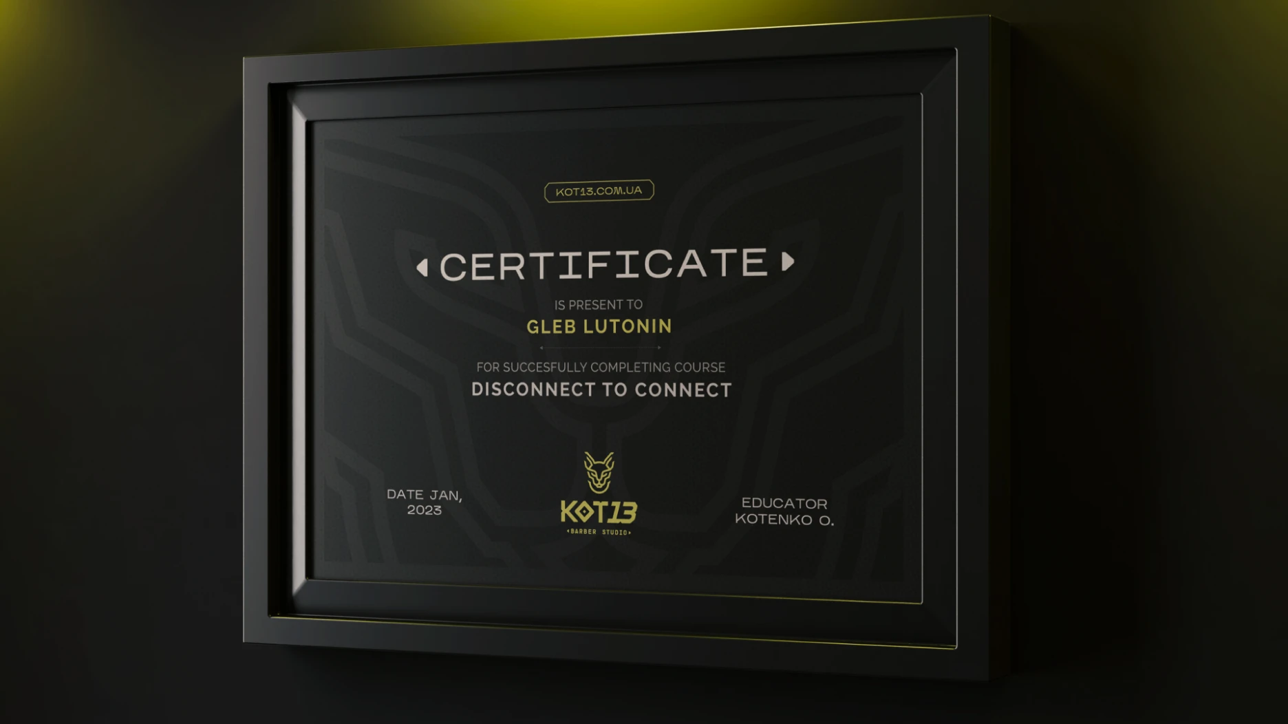
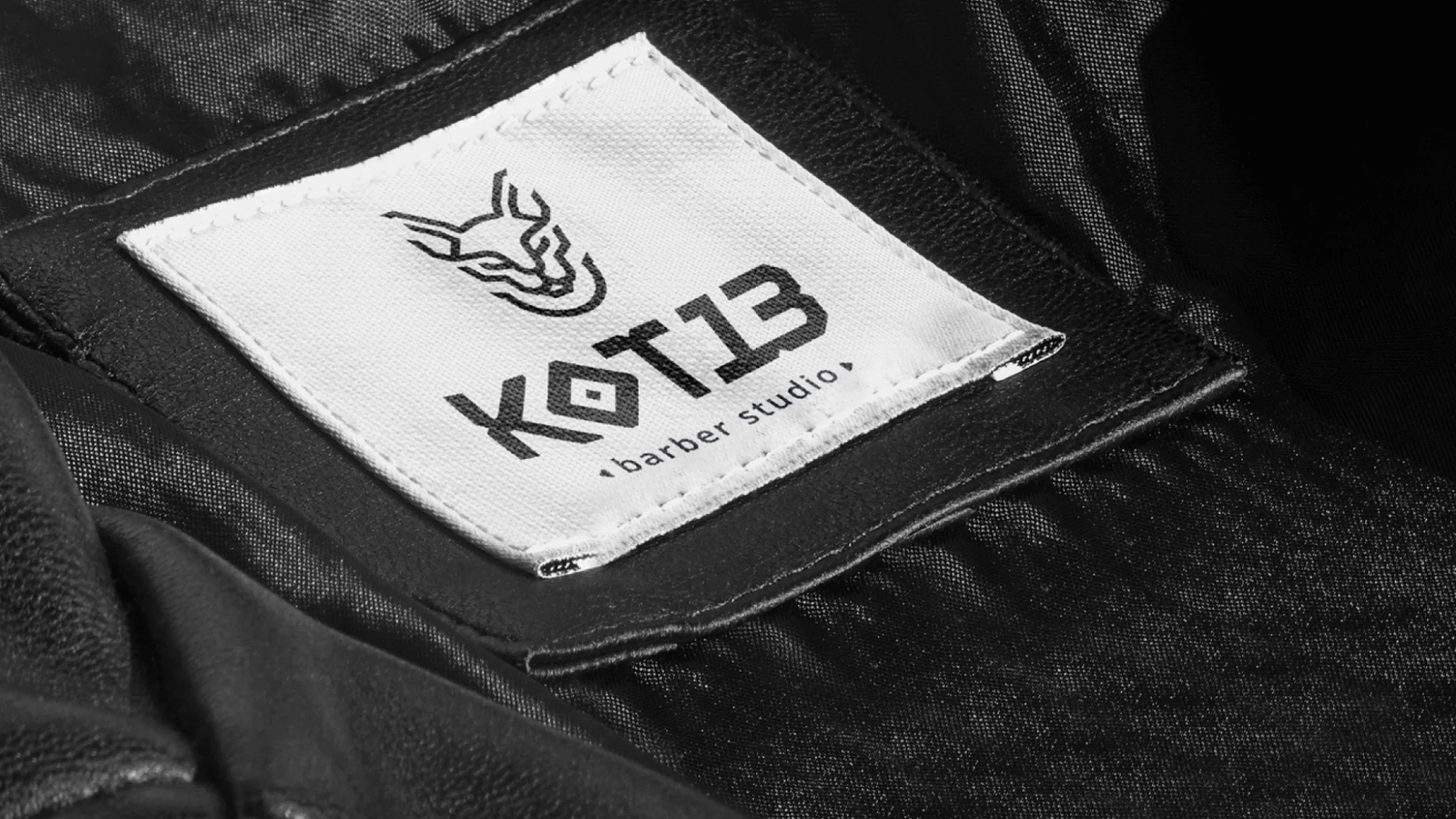
Kot13 barber studio is a spesialized barbershop. Main objective of the identity design was to refresh old logo and create memorable graphic style.
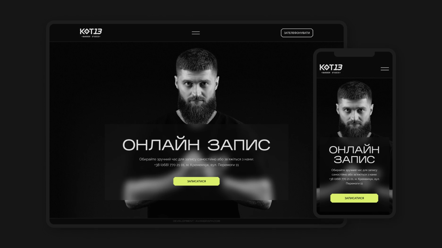
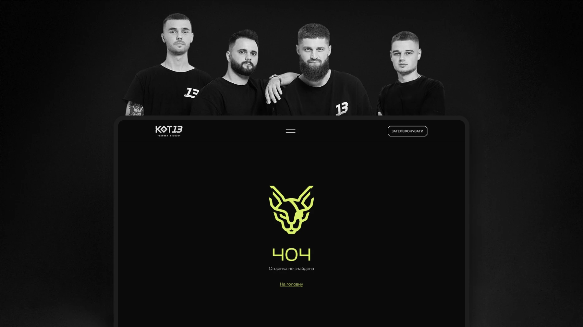
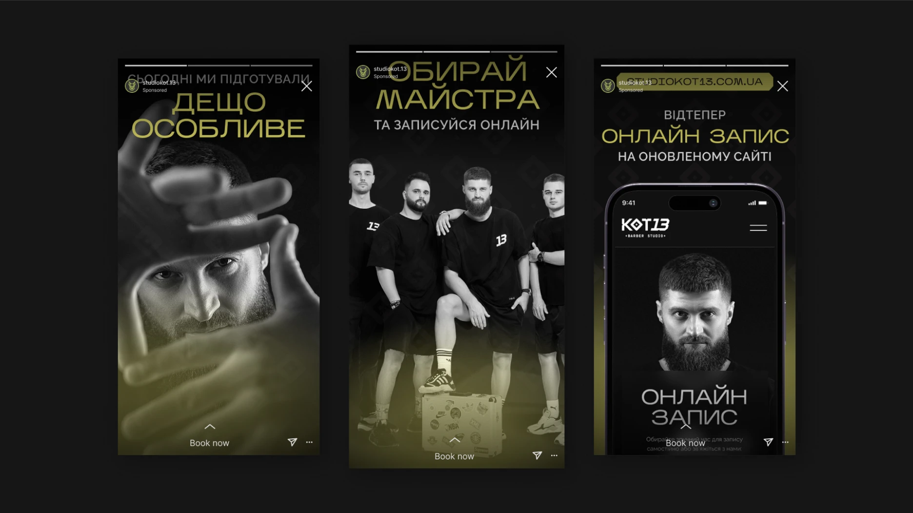
Also, the client wanted to launch new website with using a new visual style.
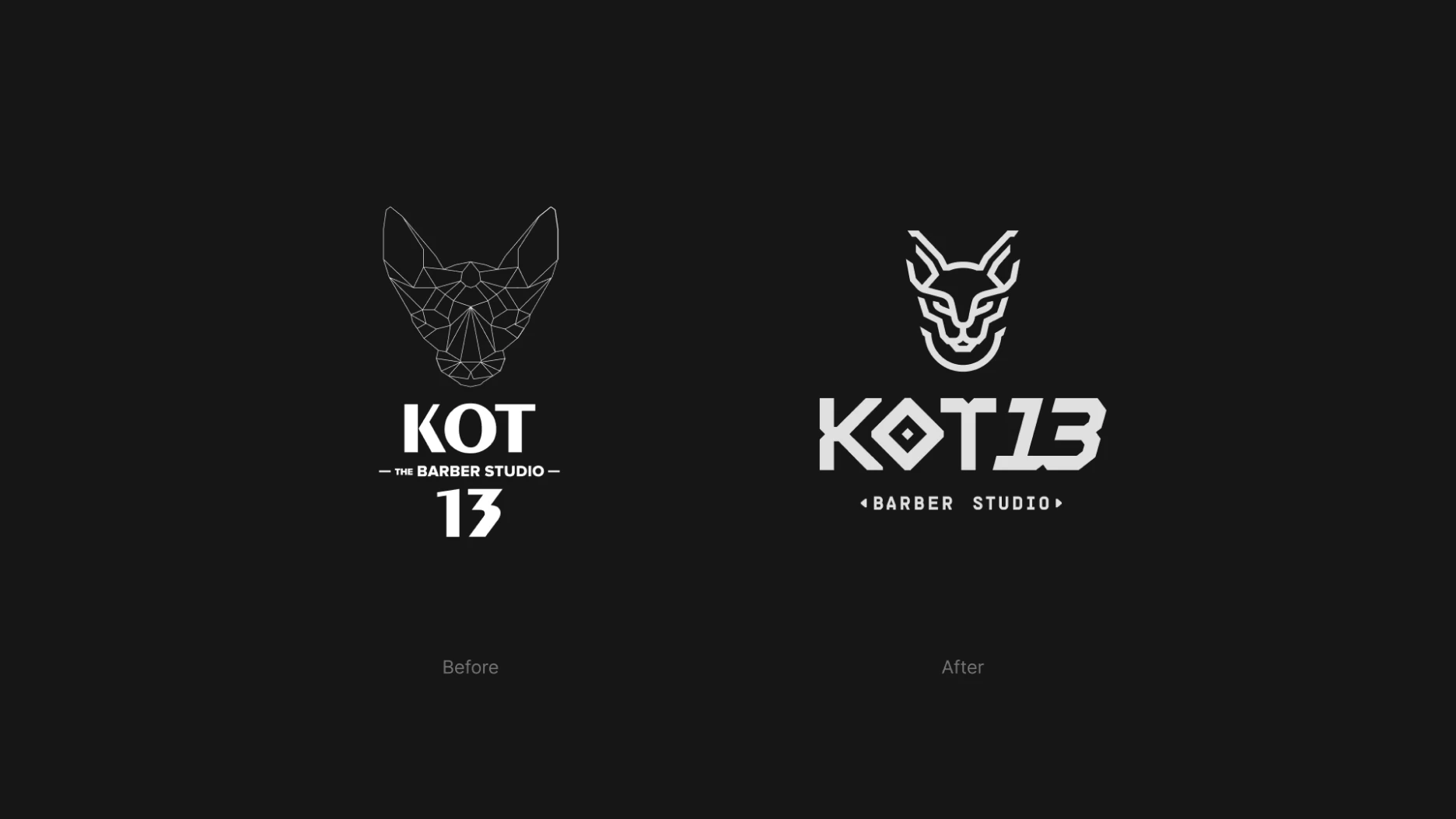
Logo
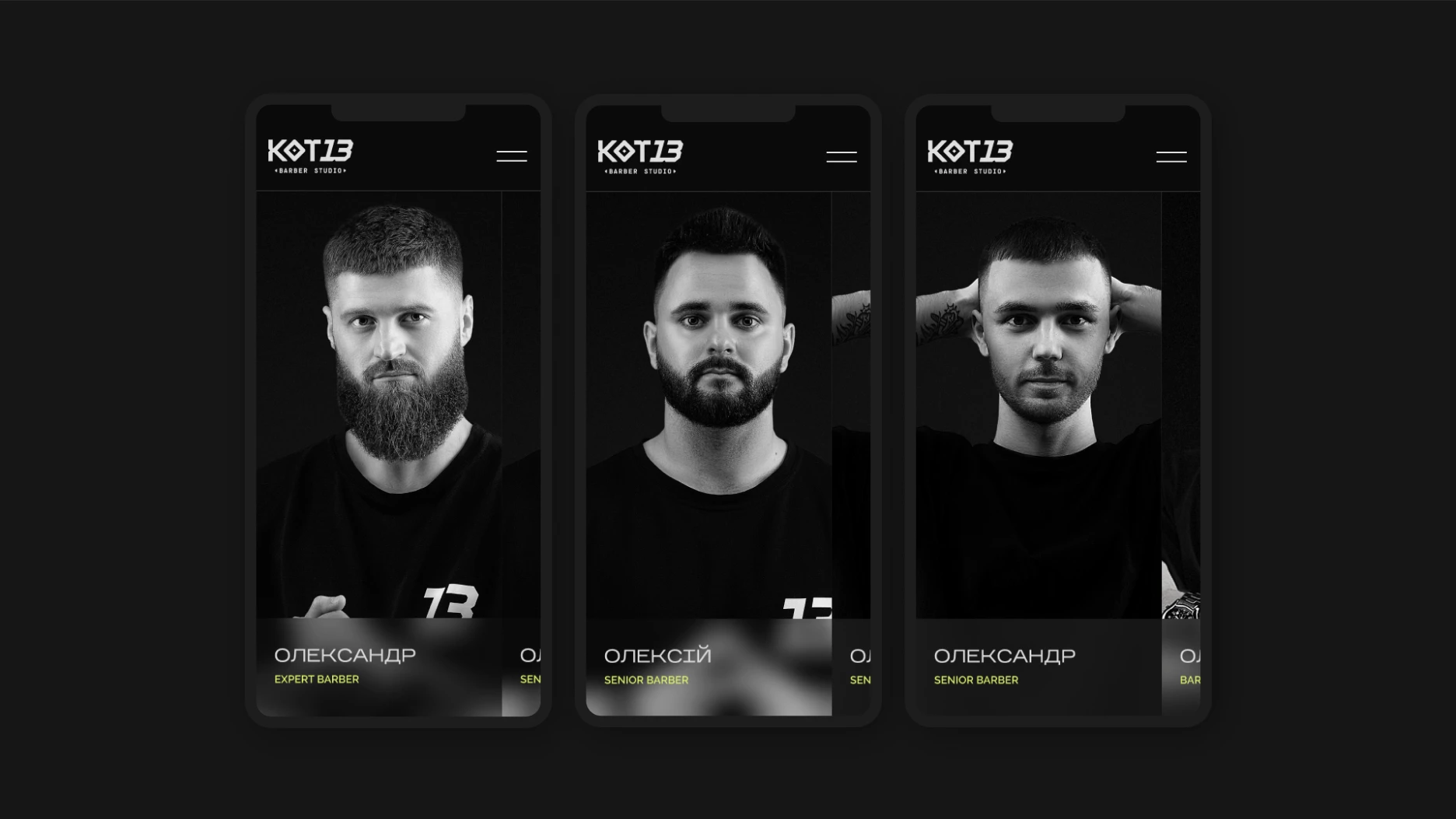
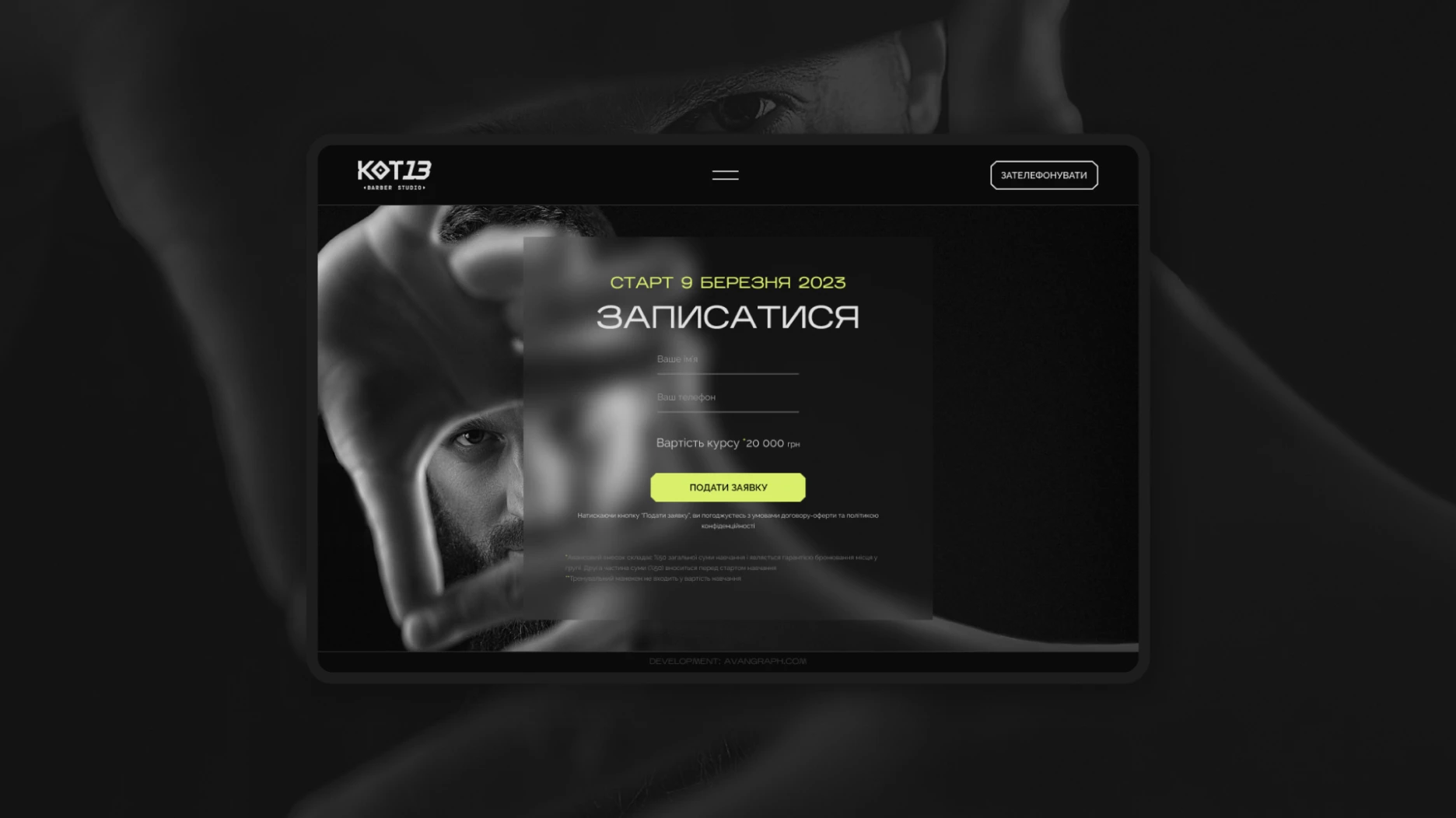
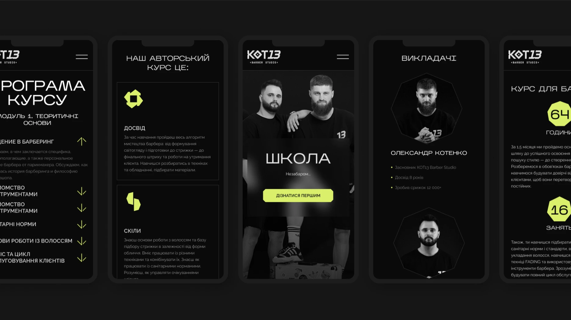
Web development