Kremenchuk city
visual identity

Project

Kremenchuk is a dynamic and at the same time calm city in the very heart of Ukraine, which many people consider their hometown to be a symbol of reliability, security and steadfastness. The modern image of Kremenchuk is much more than a post-Soviet industrial city. Here, every day is filled with calm silhouettes of the Dnipro.

Challenge

The main task was the emergence of a permanent, memorable visual image associated with the city, its activities, its character in exactly the way that the residents see it — calm, stable and a little brutal.

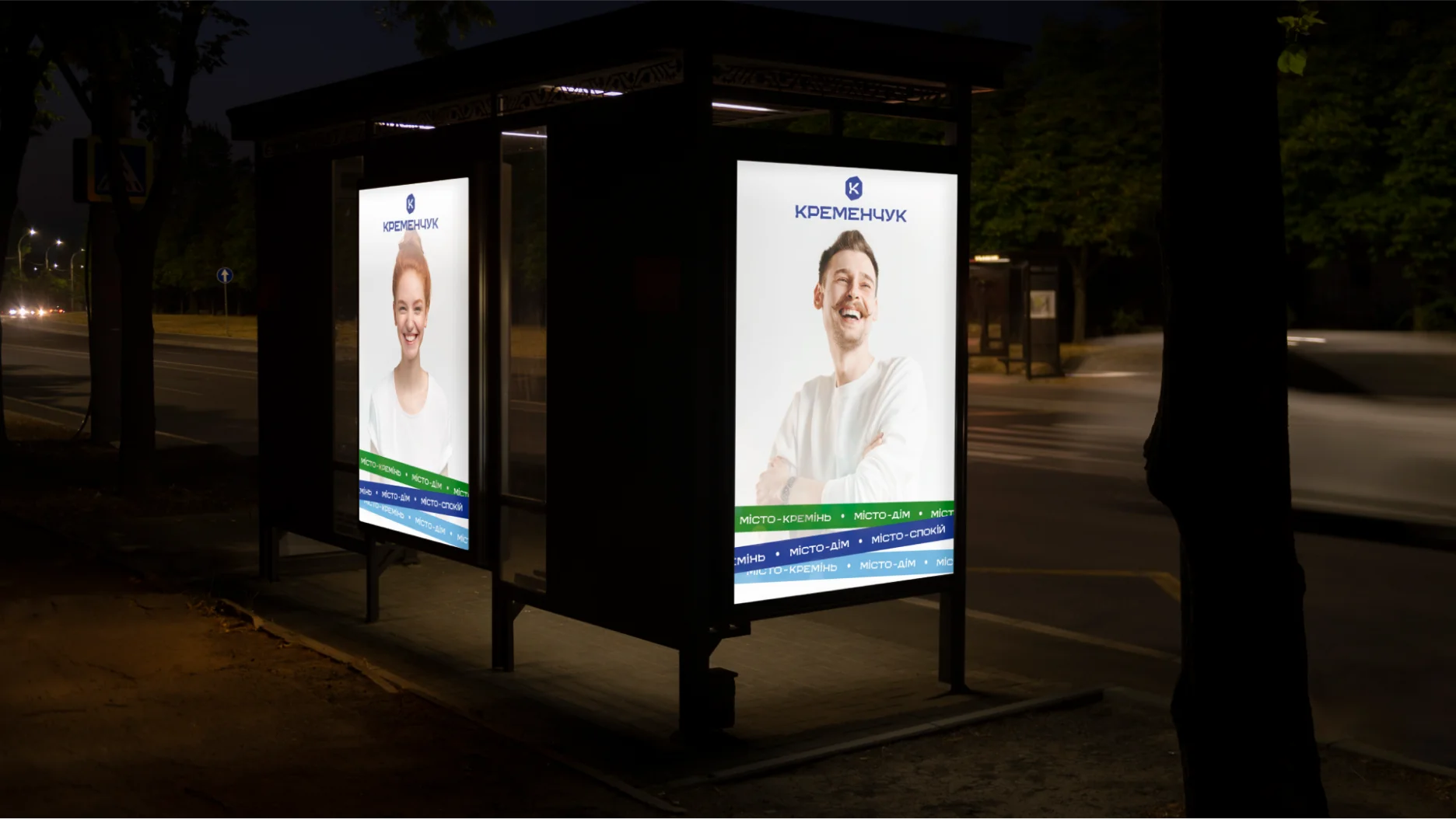
An important aspect of the development was to attract the attention of people who are busy with their daily affairs on the city streets and convey to them the idea that the city in which they live can be interesting and different, to demonstrate the positive qualities of the city.

Mission

The main mission of the communicative component of the identity of the city of Kremenchuk is to show users that the city is developing and open to new perspectives. The city is full of diversity: from industrial spaces to carefree parks, where time seems to stand still. And it is important to show this, because the multifacetedness of Kremenchuk is not just the face of the city, but its strength.

Research

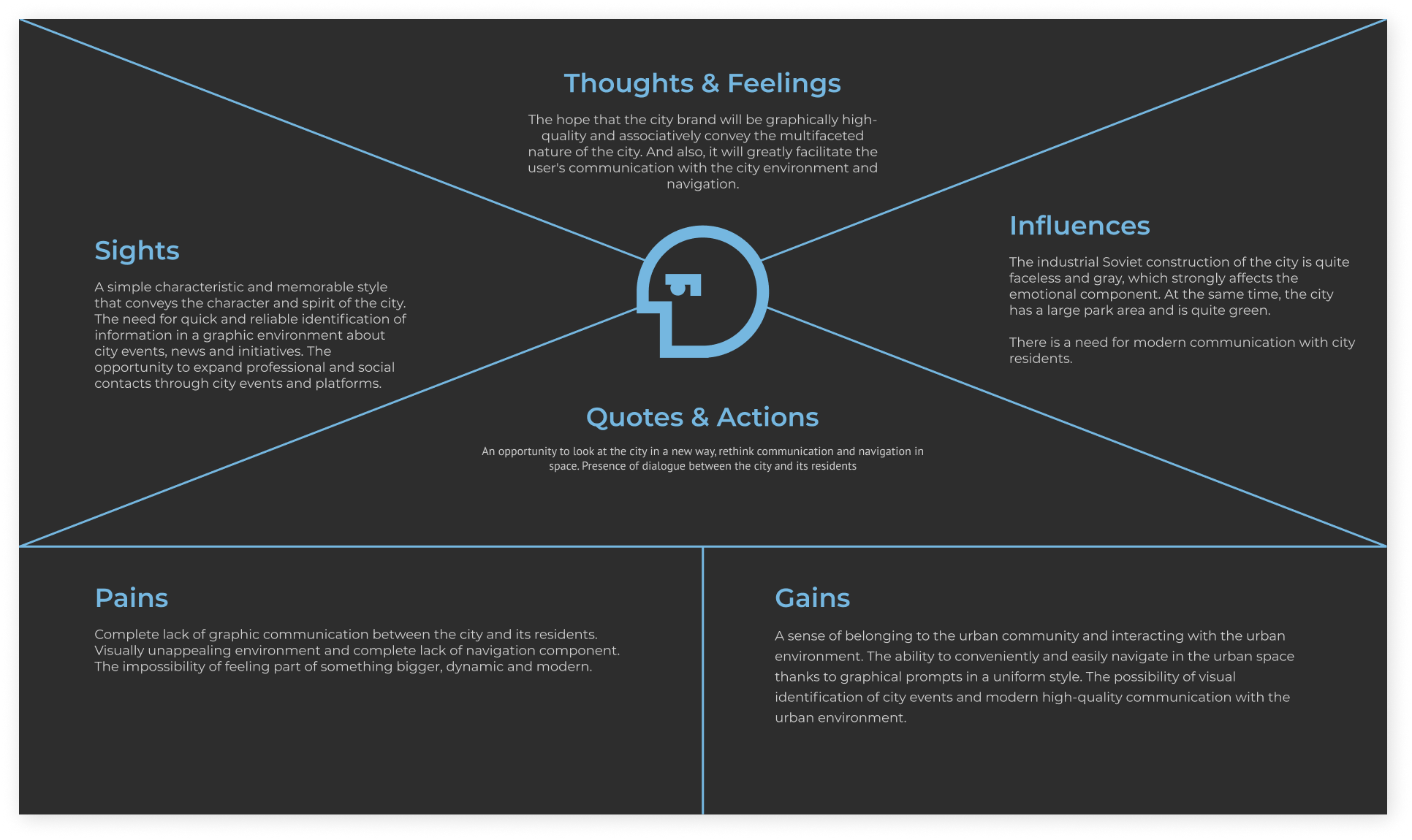
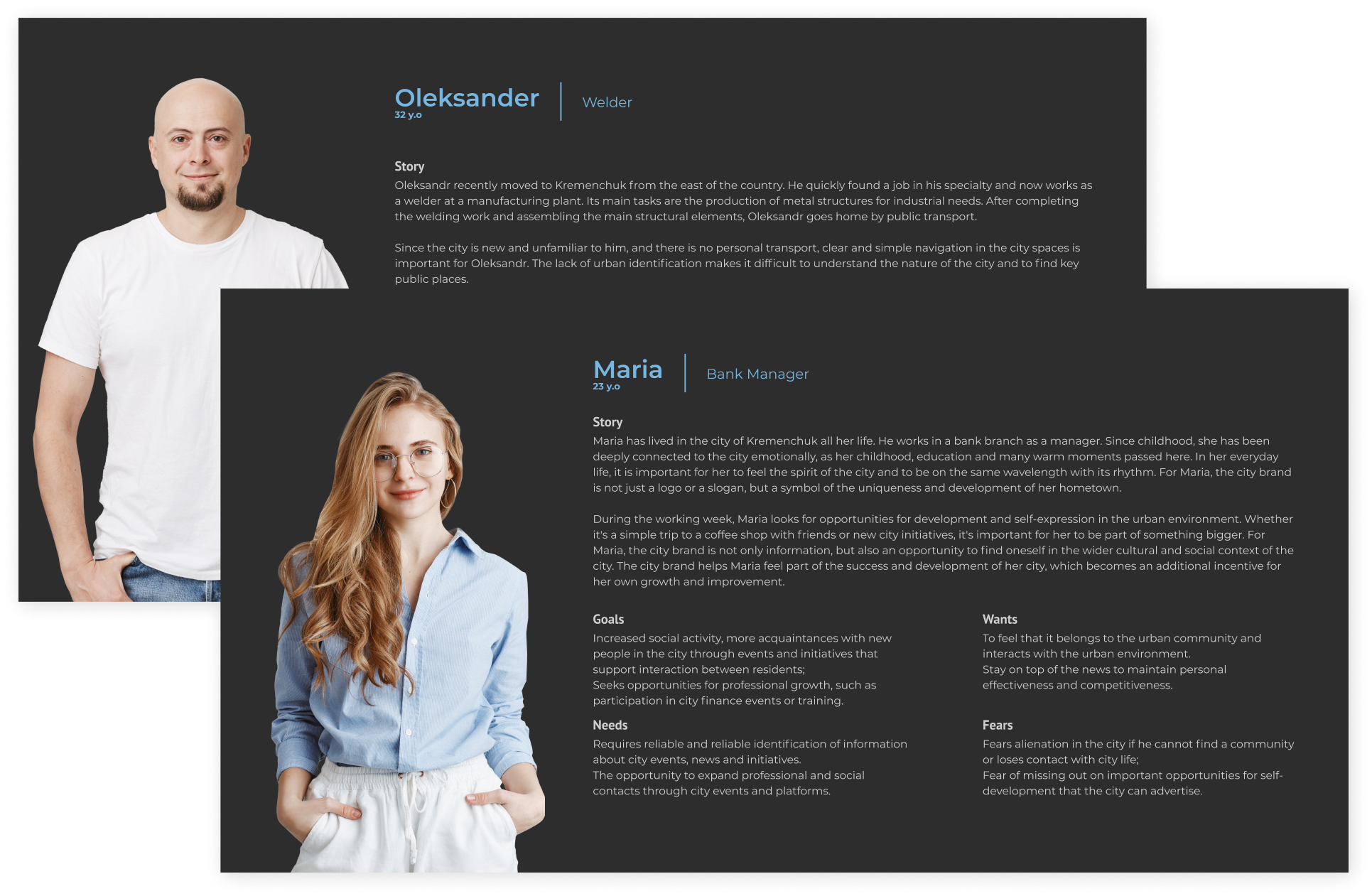
The research phase involved studying the potential users identity by surveying 112 city residents, creating personas and empathy mapping based on sociological data.

Social Polls

A survey with open-ended questions was conducted among 100+ respondents aged 18 to 55. 51.3% of the audience were men, 48.7% were women.

Logotype

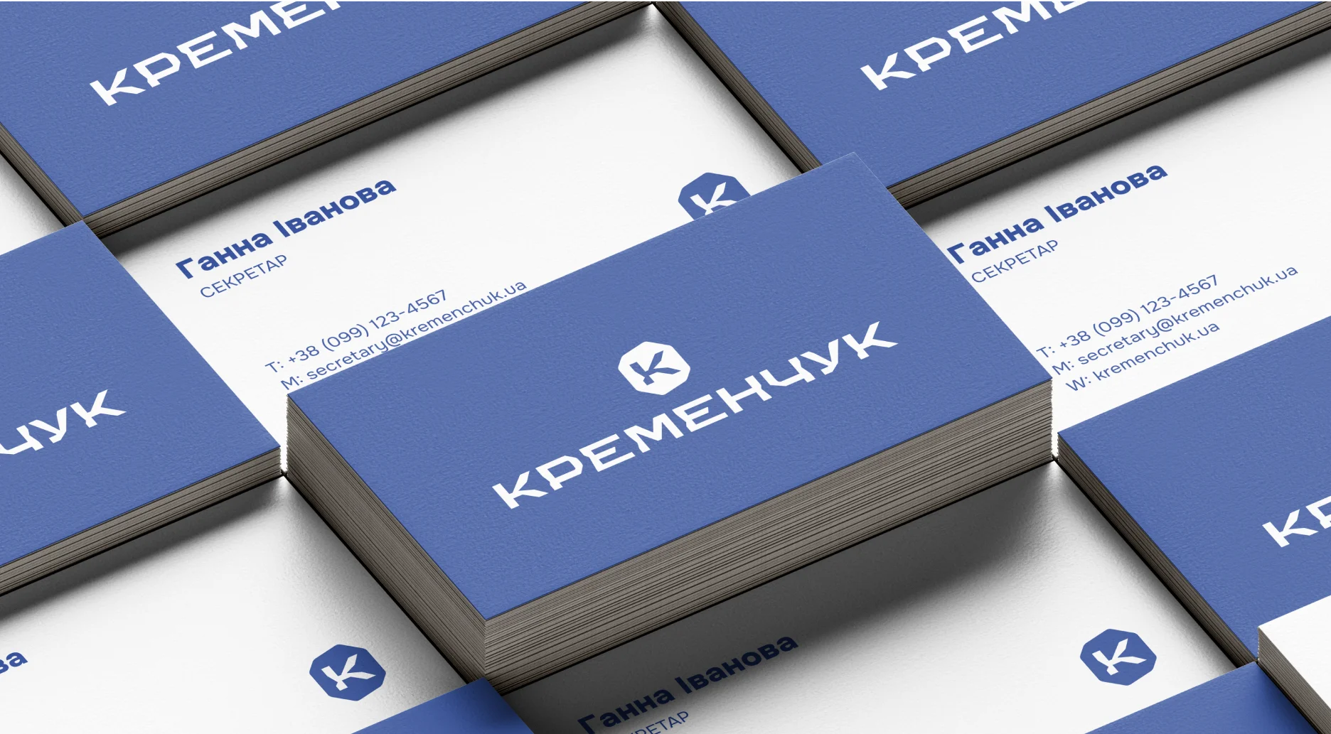
The main message of the logo is "Kremenchuk is a strong city", "a city with character", "a sustainable city".

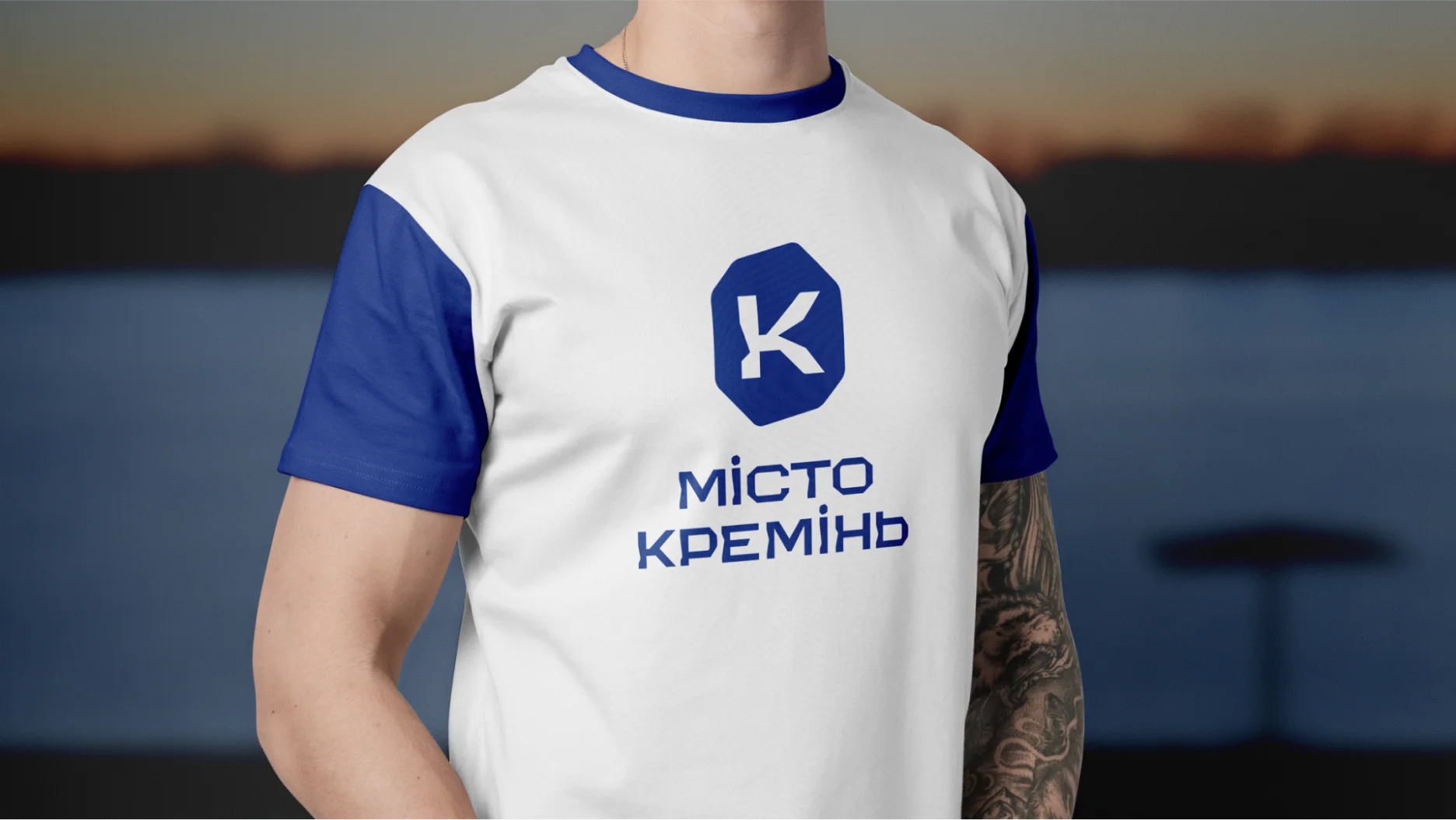
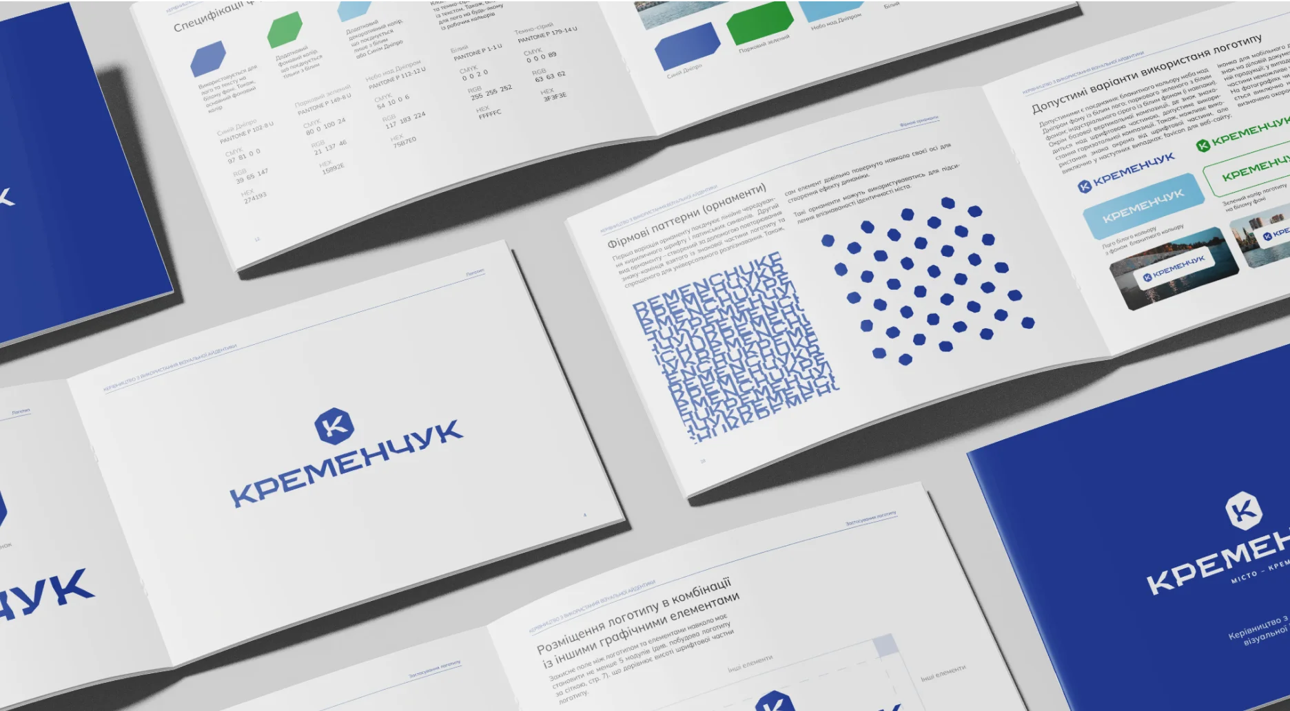
In order to display this symbolism graphically, two techniques were used. The first is an optical narrowing of the height of the letters to create the effect of stability and compositional strength. Also, it is important to note the chipping effect on the letters. Chips imitate the characteristic appearance of the mineral silicon. Such symbols allow us to draw a parallel between the people living in this city: strong, stable and firm.

Logotype grid and proportion system
Colors
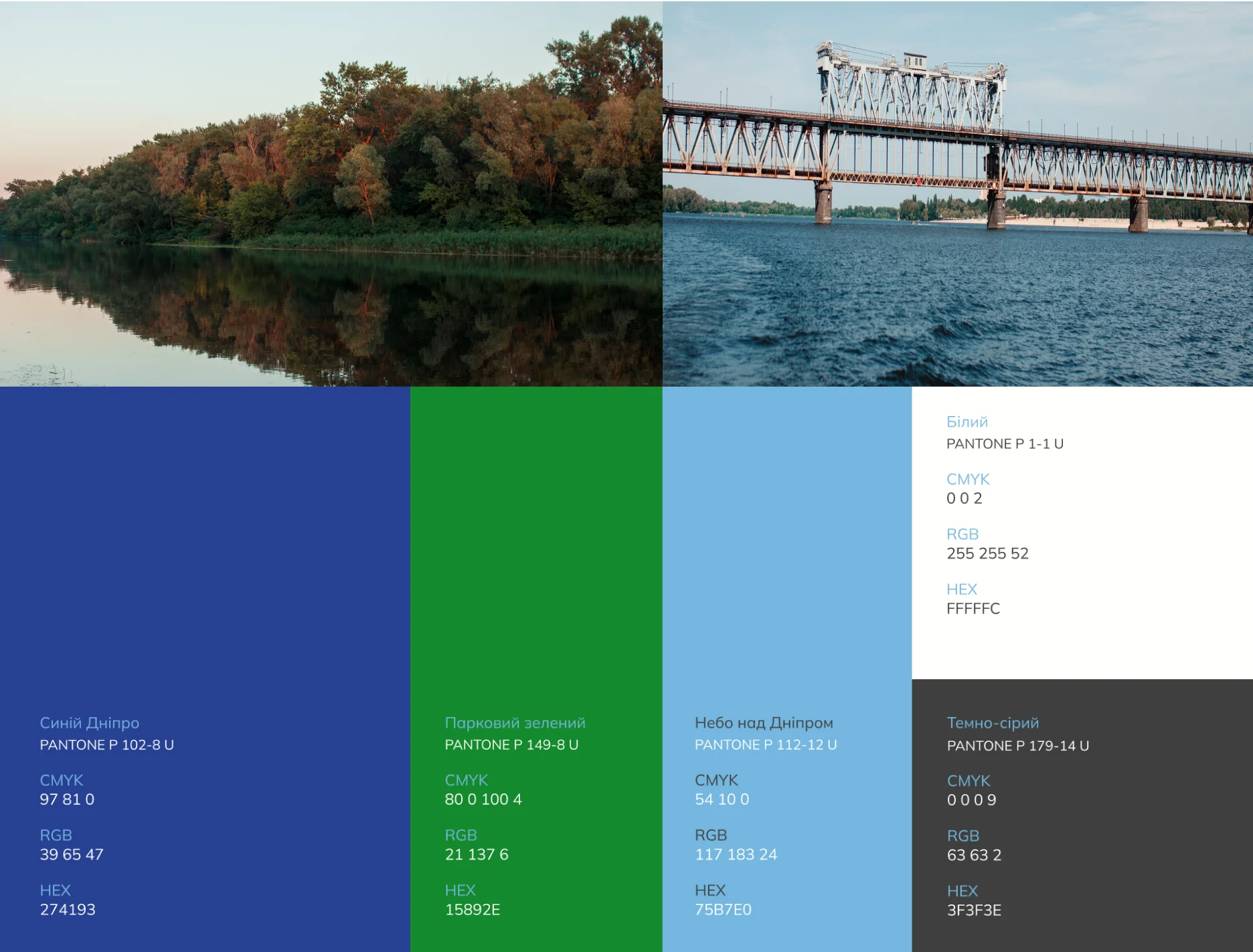
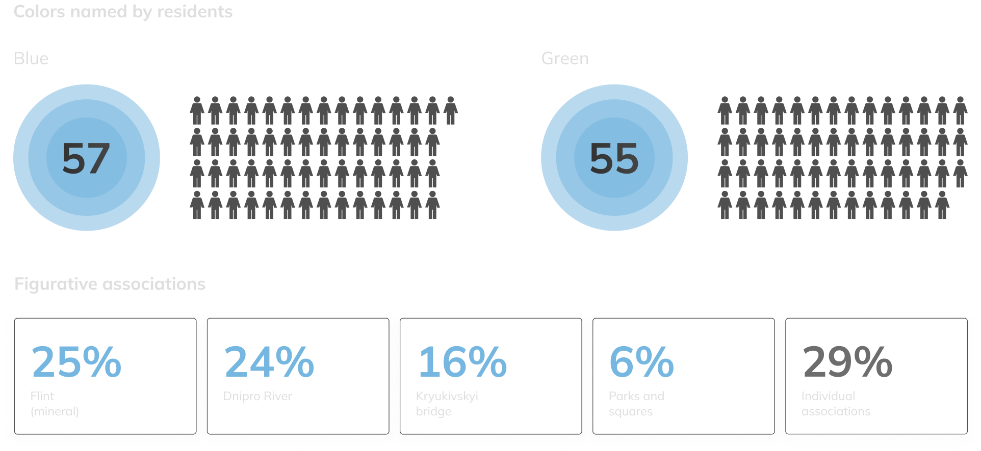
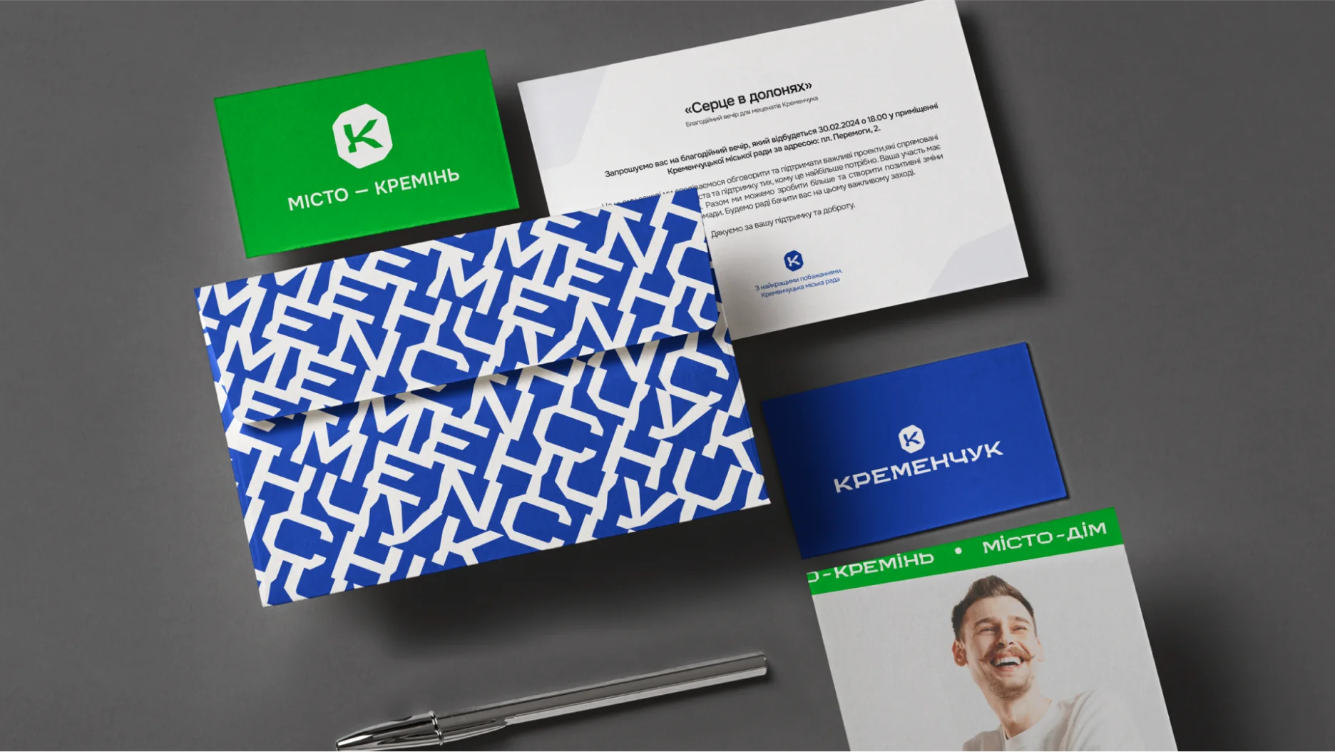
Dnipro blue and life-affirming green have always been native colors for the city's residents. Today, Kremenchuk is developing and expanding thanks to a new influx of people from the eastern regions. For many, the city has become an island of peace and new opportunities. Therefore, the blue color embodies exactly these qualities. Exactly as you can see it above the Dnieper, walking along the embankment of the park.

The colors of the city's brand identity reflected the firm character and free spirit of its residents. At the same time, one of the tasks of the brand is to fight against the faceless buildings of Ryadyan, grayness and pessimism, which is why the palette has been selected to be optimistic and one that should charge and fill with faith in the future.

Fonts

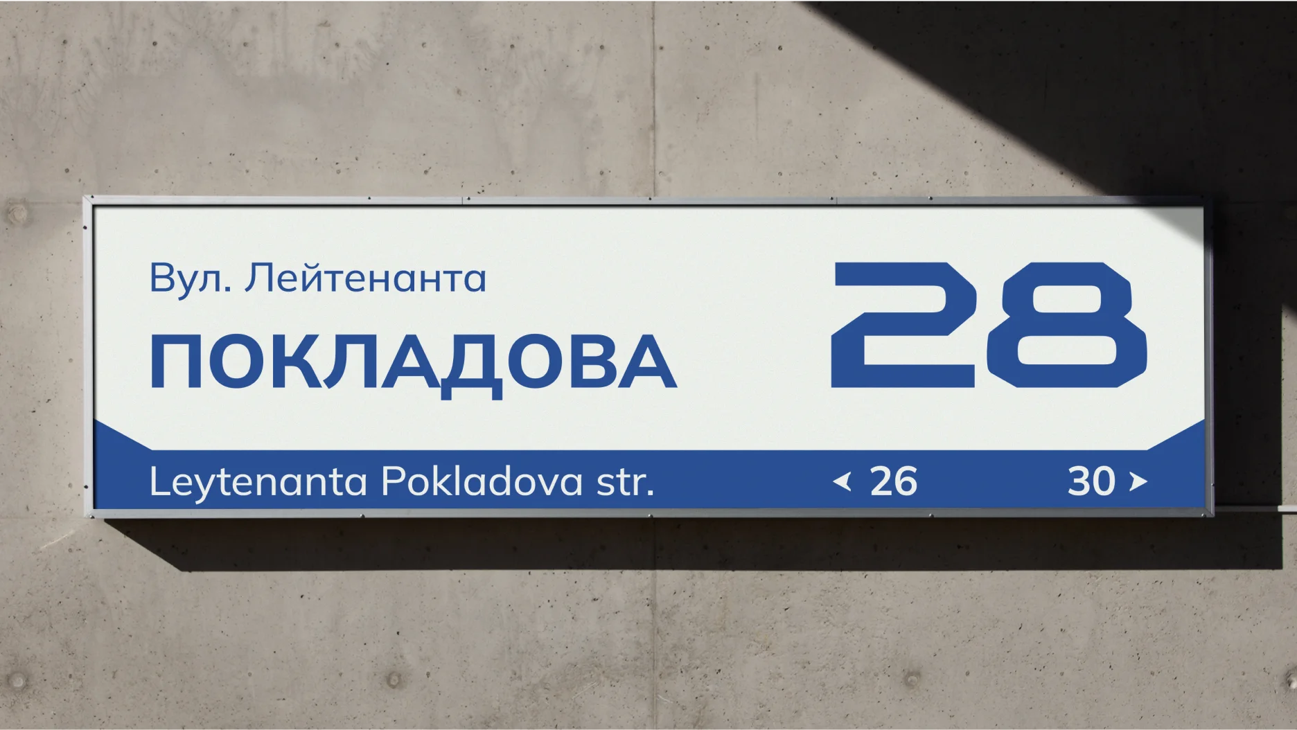
The Kremin Extended headset is designed for accented inscriptions and headings. It can serve as a trigger for the eye to draw maximum attention to a certain part of the composition. Externally, the font looks technical and conveys an industrial mood of the city, as Kremenchuk is a major industrial center in Ukraine.

Key characteristic font points

Key characteristic font points

Work Fonts

The Mulish headset is the main working one and is used to create text blocks. Mulish Regular typeface is used as a working font, Mulish Medium as subtitles.

Body text

Subtitle text

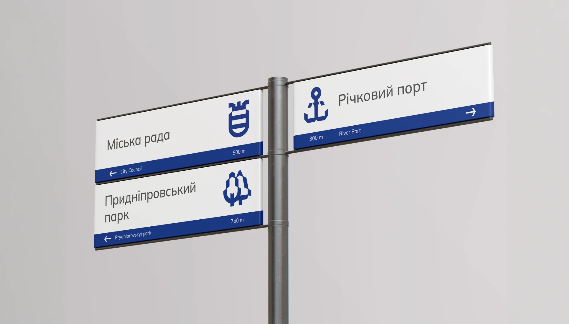
Pictografy system
& navigation

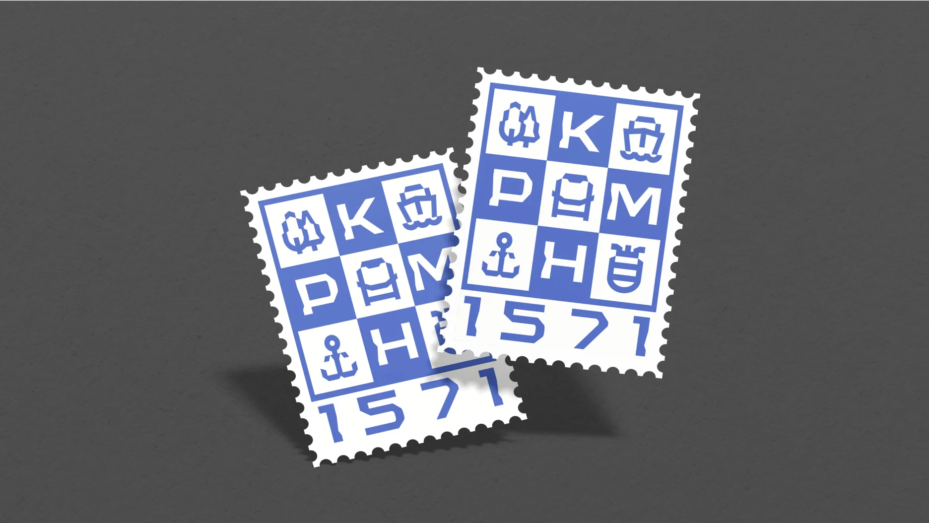
The nature of the graphics of the icons is a constructive continuation of the style of the Kremin Extended logo and font. The form is formed according to the principle of combining structural lines that create the effect of chips.

The icons are created with the help of a grid, which serves as a support for the formation of icons and plastic shapes. The creation of new icons takes place exclusively by using this grid.

Icons family

For the correct implementation of new elements of pictography, the illustrator must emphasize the main symbolic form of the object and convey its characteristic image.

Element density is variable, but should be based on modules in the middle of the grid. The size of the line cannot be smaller than the size of two modules. However, in cases where such a rule does not allow the creation of an element similar to a real object, it is allowed to deviate from this rule. Also, such an indentation is justified in diagonal lines or rounded elements to create the effect of optical compensation.

Bus station stop
Trolleybus stop
Railway station
River port
Сargo river port
Prydniprovskyi park
Urban garden
Peace park
O. Babaev Square
City council
CPAS
Police department
Hospital
Caffe

Slogan

The slogan "the city is flint" embodies two ideas: enjoy achievements and wealth, which is important to see, and at the same time feel the inner energy and emotions that make Kremenchuk unique. The visual style of the brand, with the help of expressive font graphics, reveals the dynamics of the modern city, showing its atmosphere, carefreeness and everydayness. The specially designed font adds uniqueness, emphasizing that not only high-profile events are important for Kremenchuk, but also every element of his unique aura.

Dynamic
slogans

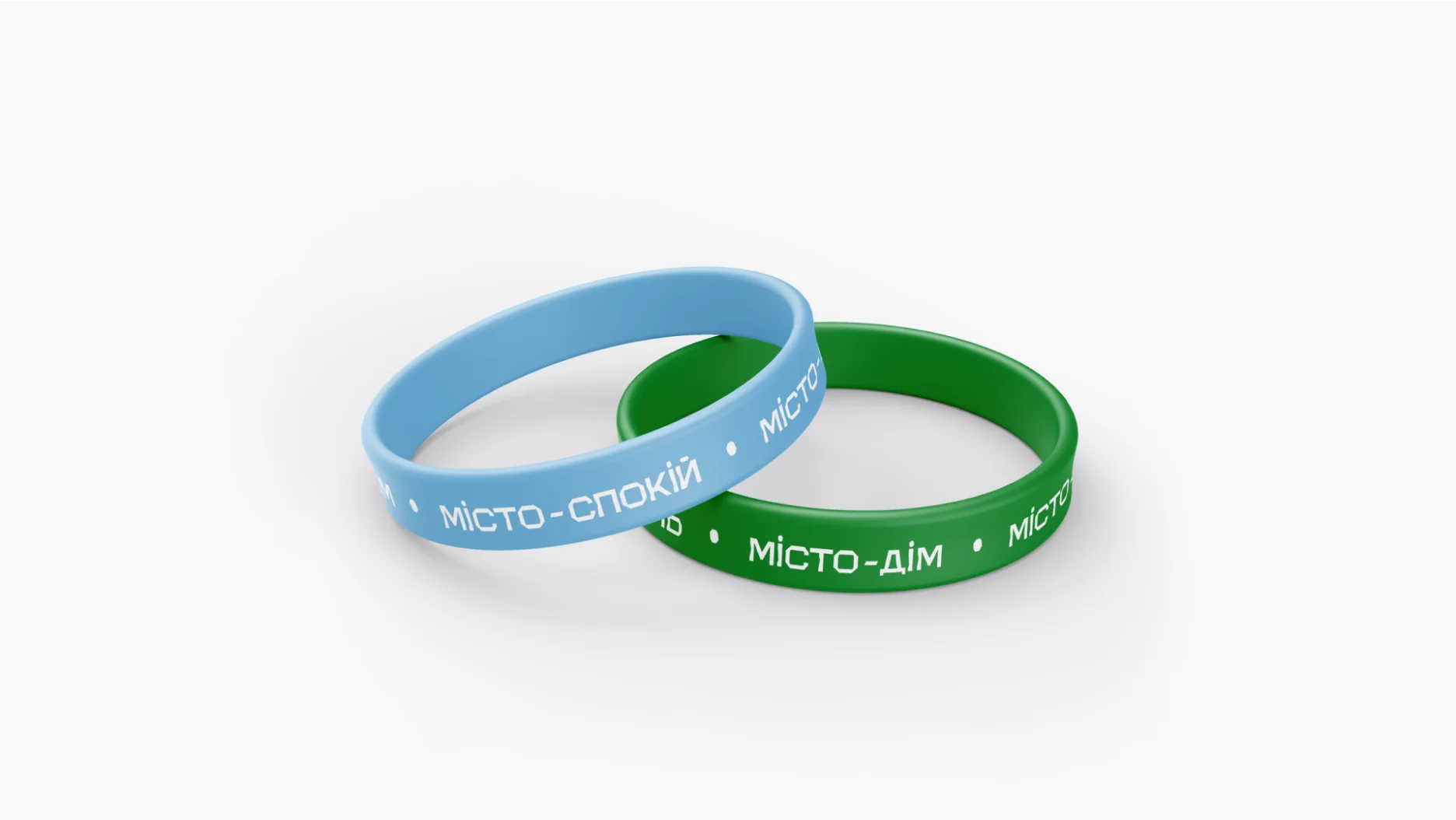
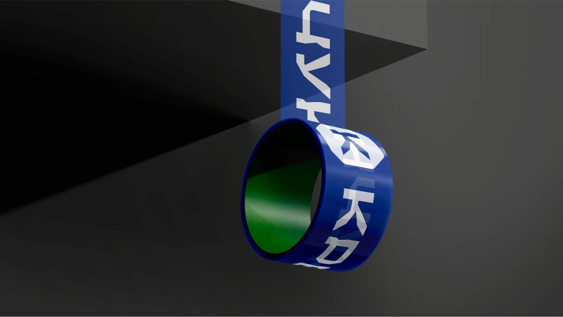
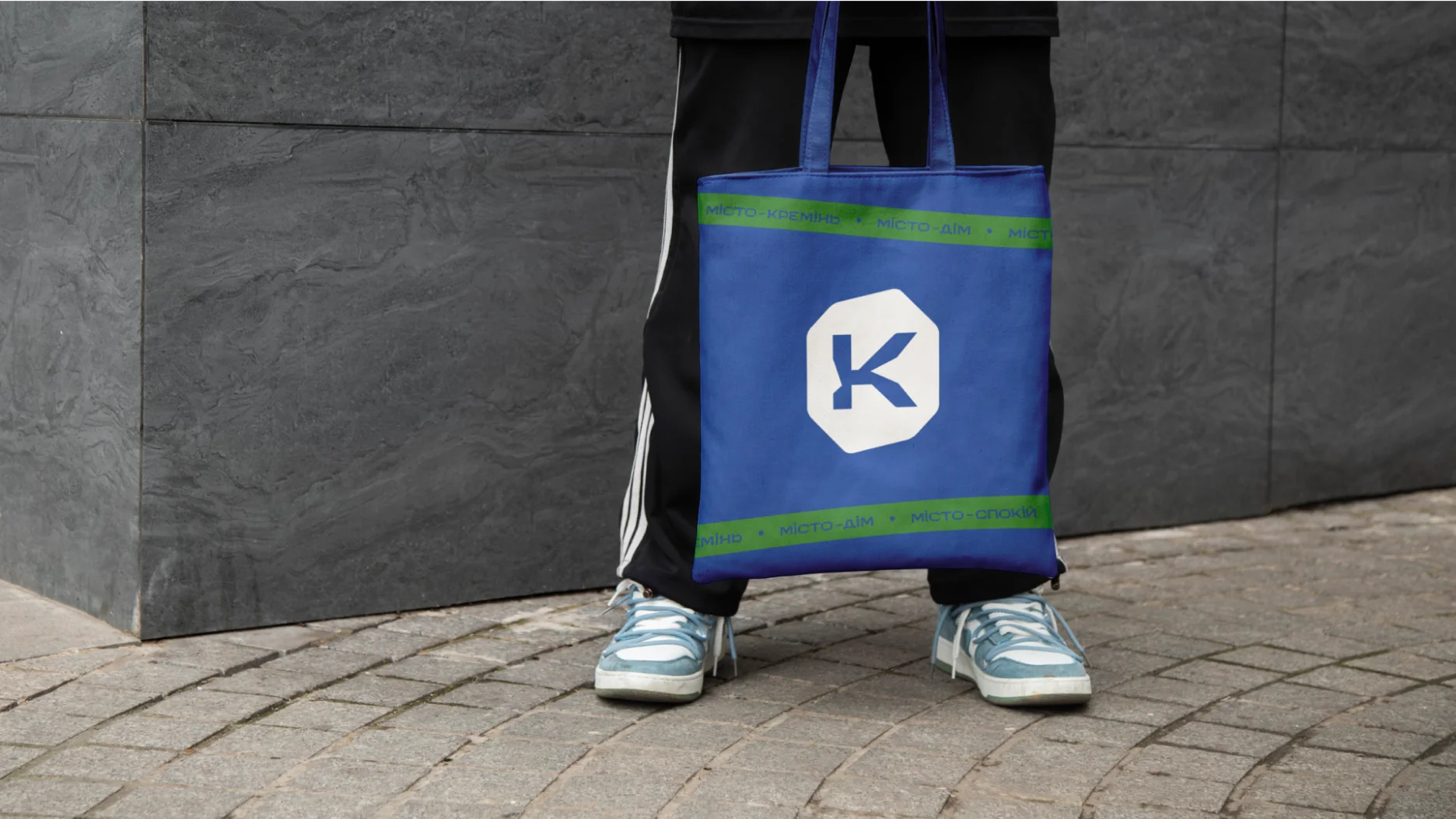
In addition to the main slogan, additional slogans can be used, which are created by combining two words, where the first word is always the word "city", and the second word is explanatory. Also, the second word be a verb. As well as the main detached tagline, any dynamic taglines are rendered in a branded font.

Thanks for watching!

Thanks for the photos: Roman Kucher