Kremenchuk city
visual identity
Project
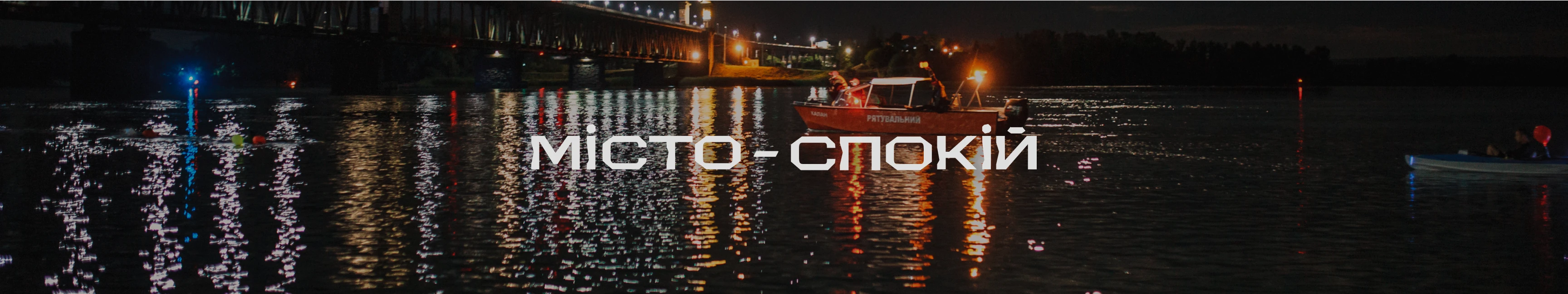
Kremenchuk is a dynamic and at the same time calm city in the very heart of Ukraine, which many people consider their hometown to be a symbol of reliability, security and steadfastness. The modern image of Kremenchuk is much more than a post-Soviet industrial city. Here, every day is filled with calm silhouettes of the Dnipro.
Challenge

Mission
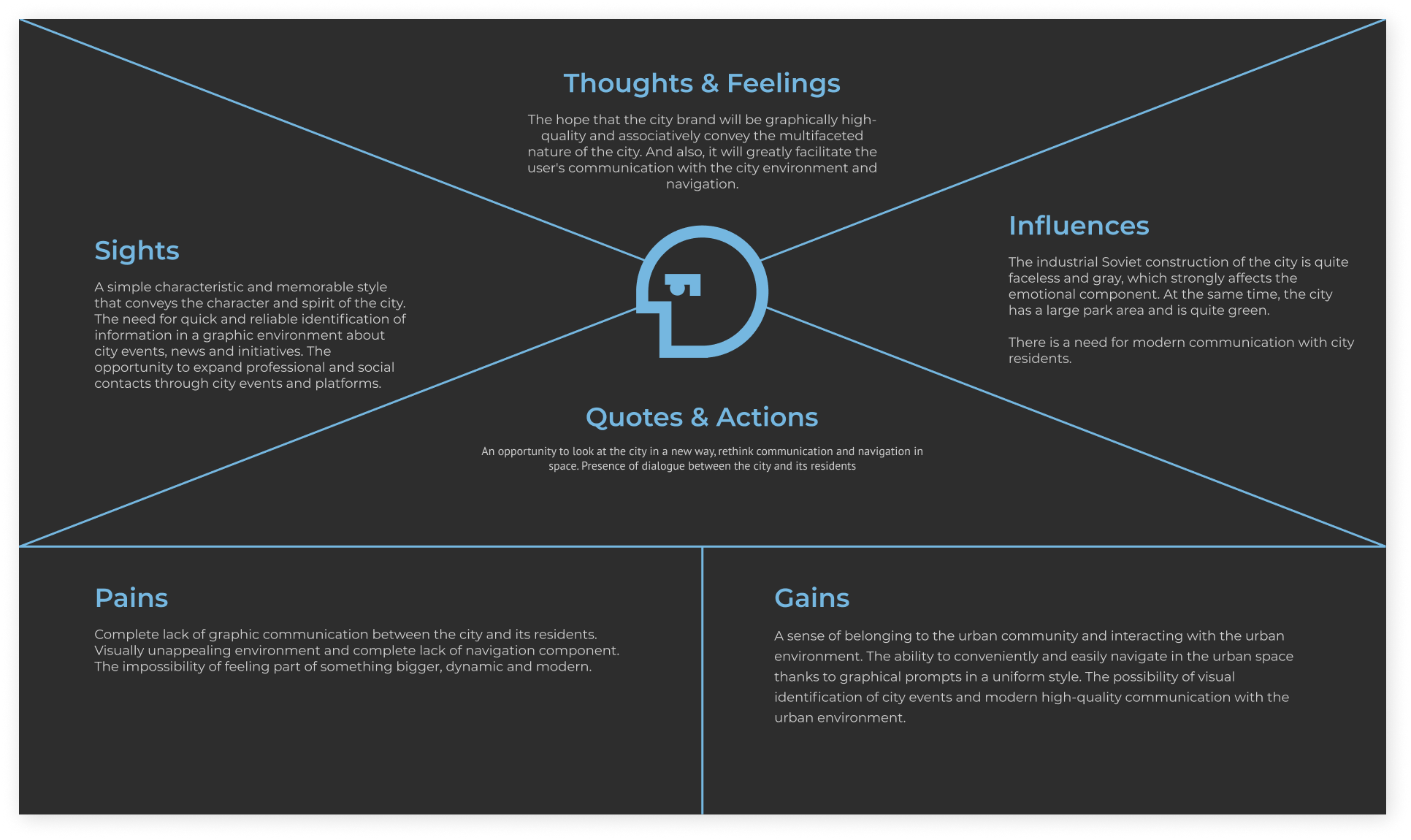
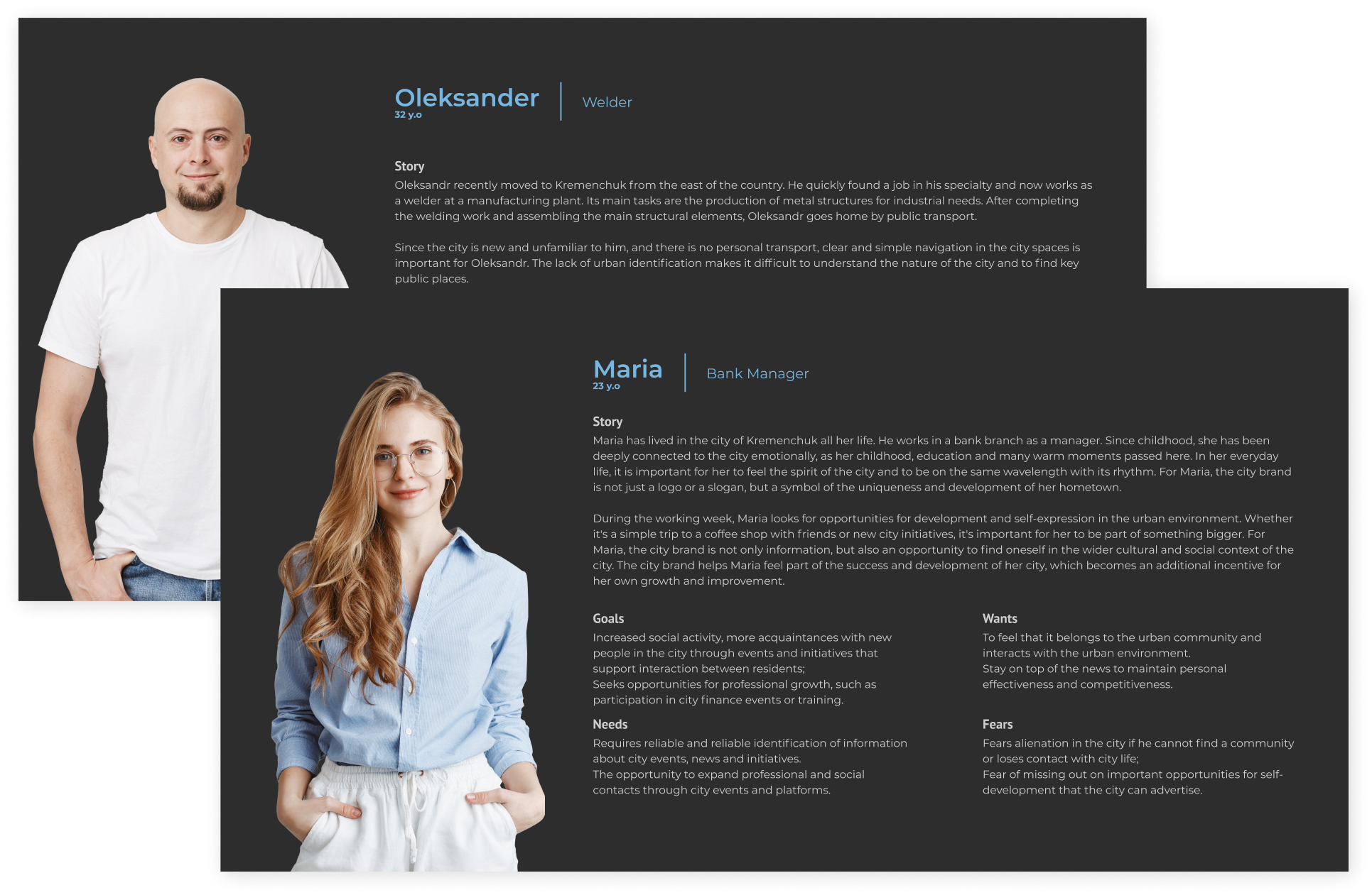
Research
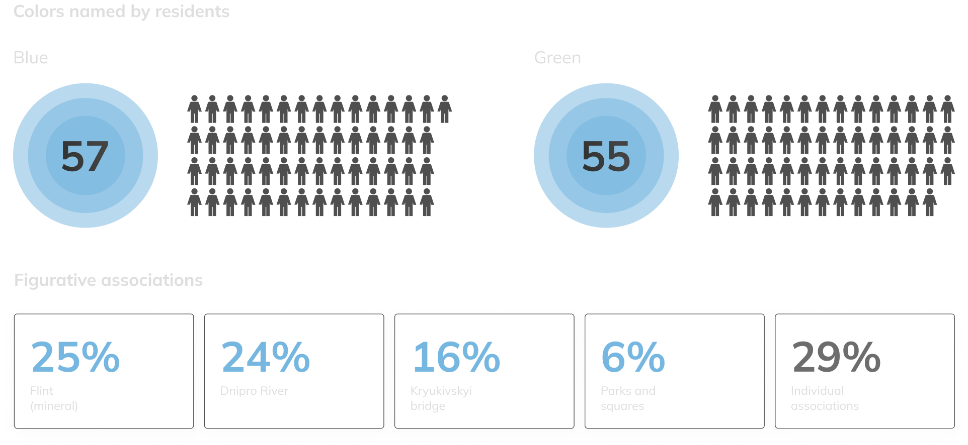
Social Polls
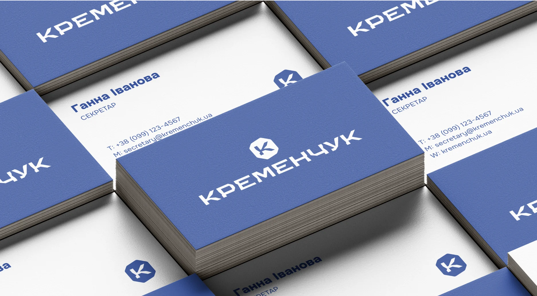
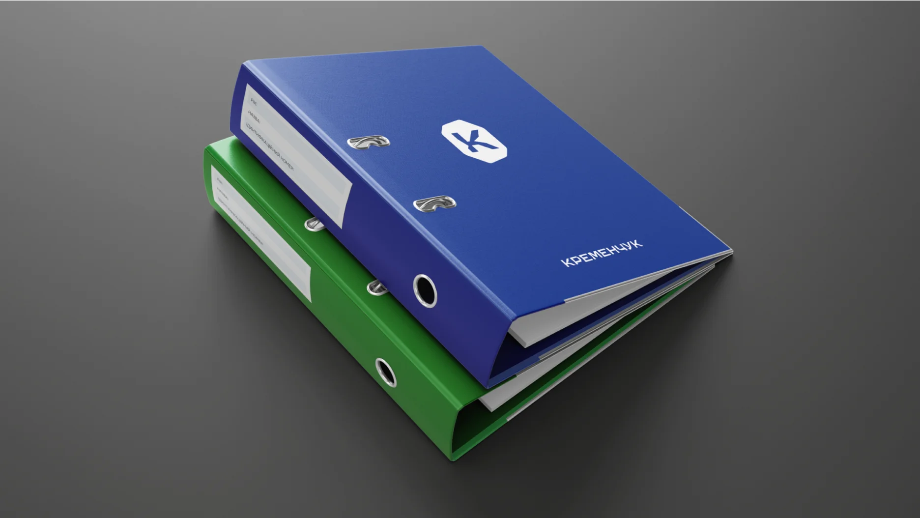
Logotype
Logotype grid and proportion system

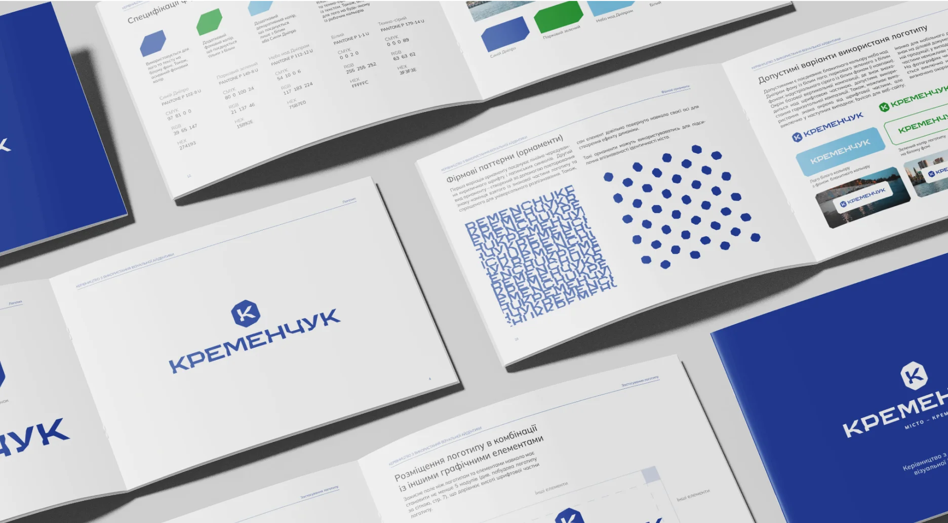
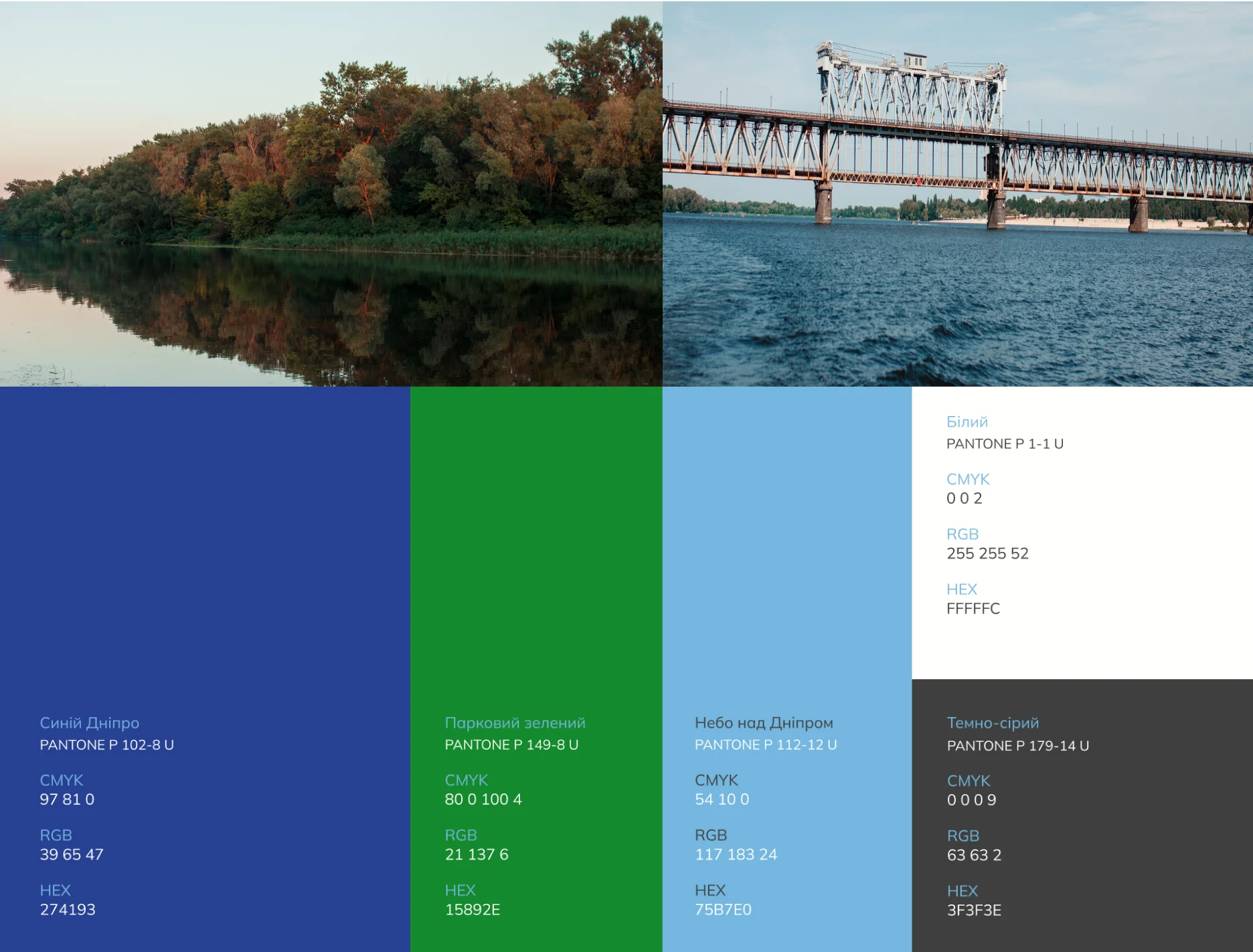
Colors
Fonts
Key characteristic font points
Key characteristic font points

Work Fonts
Body text
Subtitle text
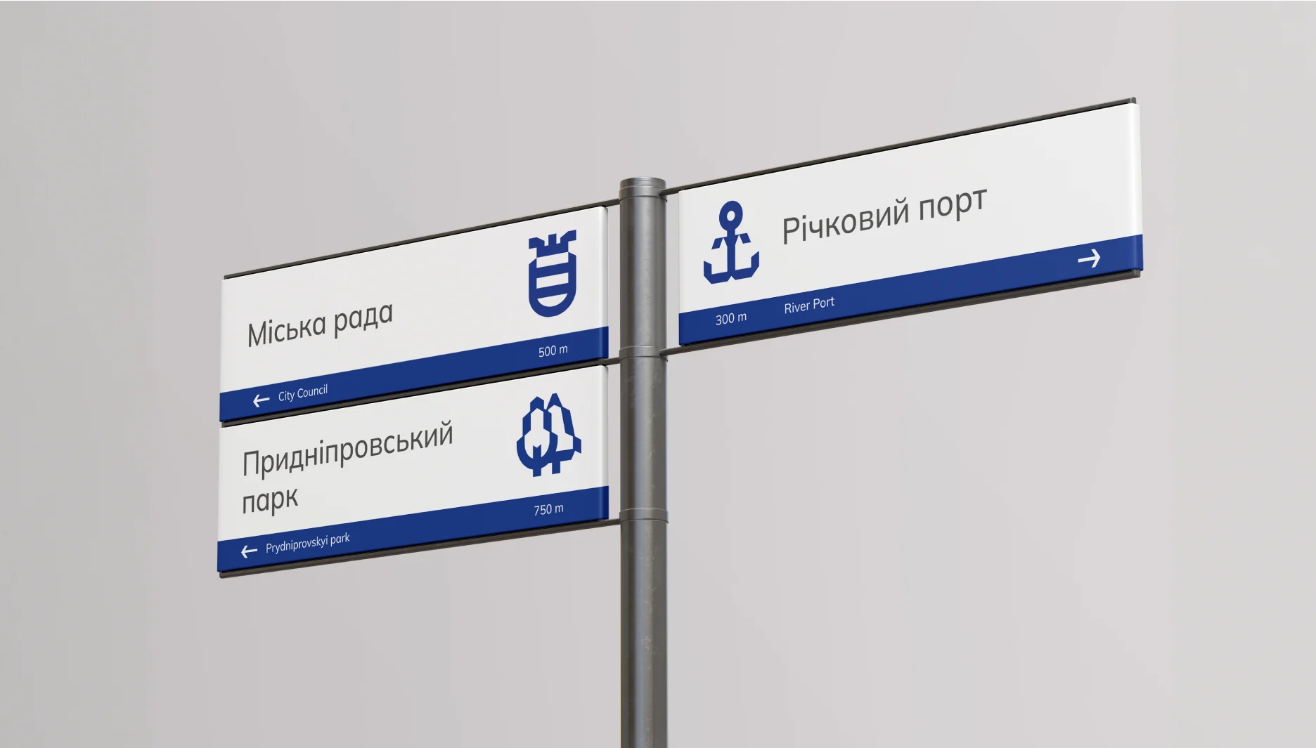
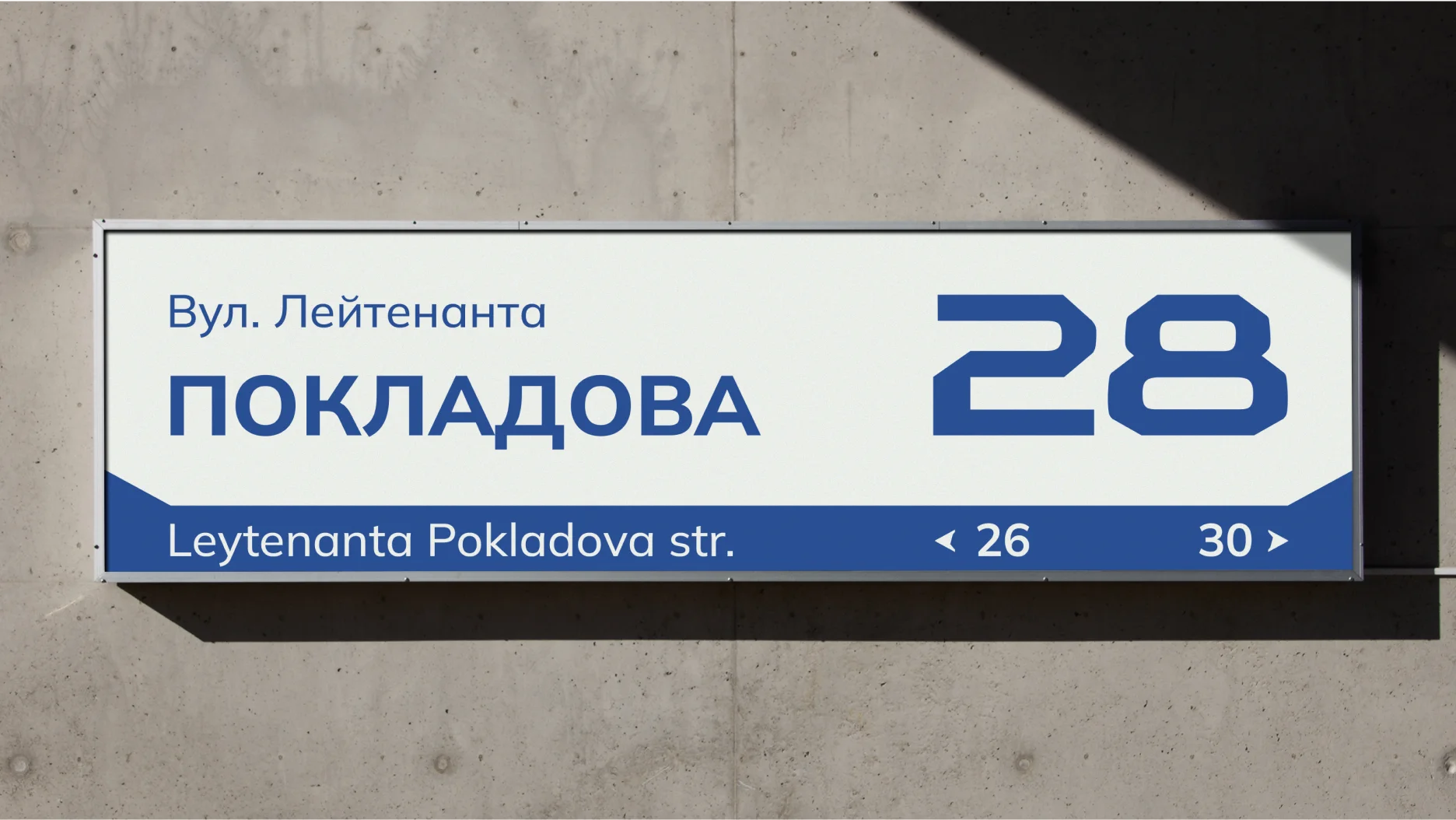
Pictografy system
& navigation
Icons family
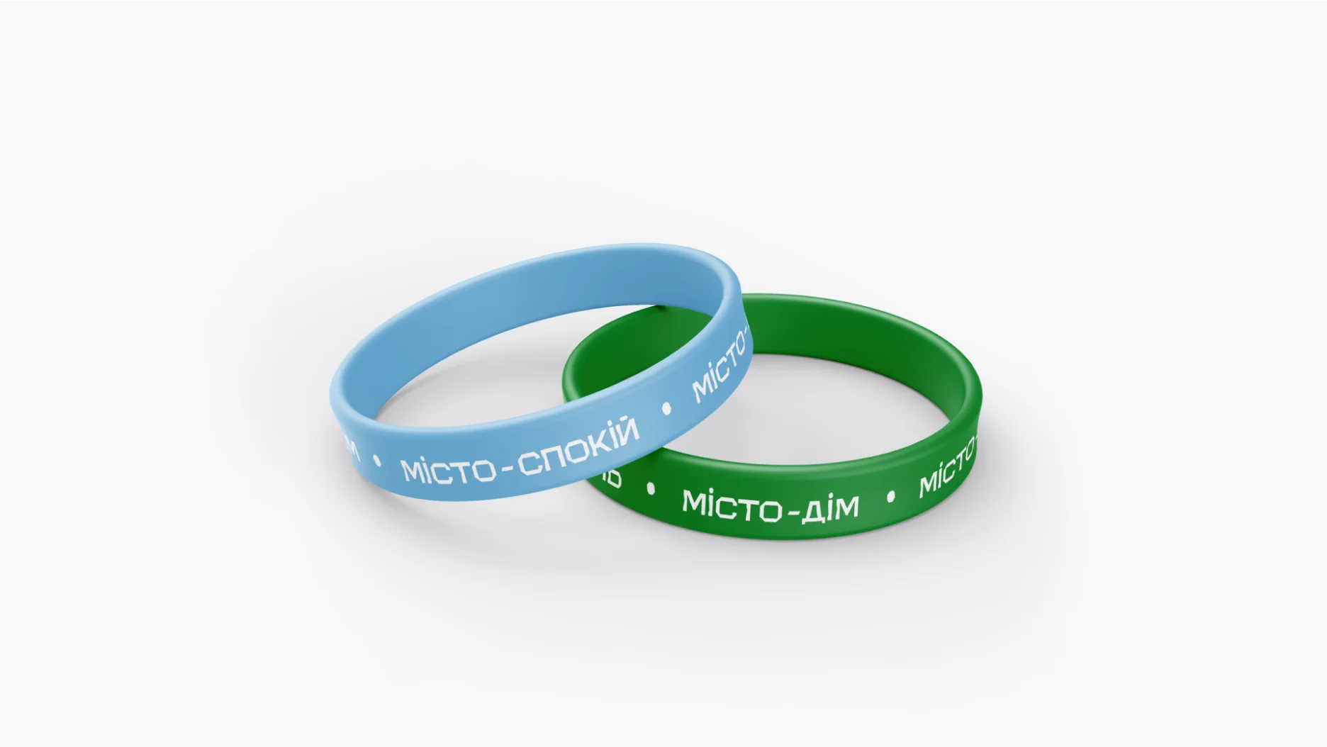
Slogan
Dynamic
slogans


Thanks for watching!
Thanks for the photos: Roman Kucher